Due to TweenMax being deprecated, I have replaced it with GSAP3, making necessary additions and adjustments.
My goal is to make loop animation with images like left to right or up to down. I made 4 samples (all samples move right to left).
Quick
- CSS Loop Animation with a Single Image
- CSS Loop Animation with Multiple Elements
- CSS Loop Animation with Text
- Loop Animation with GSAP
CSS Loop Animation with a Single Image
Prepare a single image (put all images you want to have in it). Put img for 2 times in html and wrap with a single div
<div class="loop_wrap">
  <img src="img.jpg" />
  <img src="img.jpg" />
</div>
Css is simple. Display it full-width with width: 100vw; and overflow: hidden;. And also display: flex; since we have 2 images.
.loop_wrap {
  display: flex;
  width: 100vw;
  height: 300px;
  overflow: hidden;
}

.loop_wrap img {
  width: auto;
  height: 100%;
}
For the animation, use transform: translateX() to slide images.
@keyframes loop {
  0% {
    transform: translateX(100%);
  }
  to {
    transform: translateX(-100%);
  }
}

@keyframes loop2 {
  0% {
    transform: translateX(0);
  }
  to {
    transform: translateX(-200%);
  }
}
Then apply the animation to the images with same options but with different animation-delay.
animation-timing-function: stable transforming (linear)animation-duration: animation speed (50s)animation-delay: add to only one image (it should be half of animation-duration)animation: non-stop to make a loop animation (infinite)
.loop_wrap img:first-child {
  animation: loop 50s -25s linear infinite;
}

.loop_wrap img:last-child {
  animation: loop2 50s linear infinite;
}
Why <img /> for 2 times
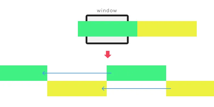
Let’s take a look graphic explanation.
Image 1 (green) repeats moving from the x-axis 100% to -100% and back to 100%. Image 2 repeats moving from from the x-axis 0% to -200% and back to 0%. This makes infinite loop animation.
Demo
CSS Loop Animation with a Single Image
CSS Loop Animation with Multiple Elements
You can make animation with multiple elements and each element has text and link.
Separate elements in 2 groups and wrap 2 groups with a single div. Inside each group, you can dupulicate same elements or have different elements.
<div class="loop_wrap">
  <ul>
    <li>
      <a href="#"><img src="img_01.jpg" alt="" />CAR</a>
    </li>
    <li>
      <a href="#"><img src="img_02.jpg" alt="" />CITY</a>
    </li>
    <li>
      <a href="#"><img src="img_03.jpg" alt="" />TAXI</a>
    </li>
    <li>
      <a href="#"><img src="img_04.jpg" alt="" />NEON</a>
    </li>
  </ul>
</div>
CSS animation is the same with first sample.
But one thing is different from first sample is animation-play-state: paused. By adding this, when the user put the mouse on the one of elements, the loop will stop. So it doesn’t make the user struggle to click the link.
.loop_wrap:hover ul {
  animation-play-state: paused;
}
Demo
CSS Loop Animation with Multiple Elements
CSS Loop Animation with Text
You can also make loop animation with only texts. The html should be like this:
<div class="loop_wrap">
  <div>How to make a loop animation.</div>
  <div>How to make a loop animation.</div>
  <div>How to make a loop animation.</div>
  <div>How to make a loop animation.</div>
  <div>How to make a loop animation.</div>
</div>
I added white-space: nowrap to each text element so that it does not break the line.
.loop_wrap div {
  flex: 0 0 auto;
  white-space: nowrap;
}
Same animation with previous samples. I changed how apply to the elements by using :nth-child(odd) and :nth-child(even).
.loop_wrap div:nth-child(odd) {
  animation: loop 50s -25s linear infinite;
}

.loop_wrap div:nth-child(even) {
  animation: loop2 50s linear infinite;
}
Demo
Loop Animation with GSAP
If you want to make loop animation with JavaScript, you can use “GSAP”.
Prepare a single image and wrap it by a div.
<div id="loop" class="loop_wrap">
  <img src="img.jpg" alt="" />
</div>
CSS is like this:
.loop_wrap {
  display: -webkit-flex;
  display: flex;
  height: auto;
  overflow: hidden;
}

.loop_wrap > * {
  height: auto;
}
Use “Timeline” for setting animation. Making loop with repeat: -1. If you want to pause when the user mouse over, you can make it with tl.pause().
$(function () {
  const loop = document.getElementById("loop_js");

  // create timeline
  const loopAnim = gsap.timeline({
    repeat: -1, // loop
  });

  let loopItem = (window.innerWidth, loop.children[0]);

  // apply width to the image
  loopItem.style.width = `${window.innerWidth}px`;
  loop.style.width = `${window.innerWidth * 3}px`;

  loop.appendChild(loopItem.cloneNode(true));
  loop.appendChild(loopItem.cloneNode(true));

  // setting for animation
  loopAnim
    .to(loop, { duration: 100, ease: "power0.easeNone", xPercent: -66.6666 })
    .to(loop, { duration: 0, ease: "power0.easeNone", x: 0 });
});